

Grids
Grid Overview
The Grid reporting component has been designed to portray multidimensional query results in the most intuitive fashion while still retaining the flexibility to show the almost infinite number of query types possible and the speed to render the results in a reasonable and timely manner.
The grid component supports multiple grid types:
- Flat Grids
- Flat Multi-Color Grids
- Multi-Tier Grids
- Spark Line Grids
- Spark Bar Grids
- Accounting Grids
All grid types provide the same results, but illustrate the hierarchical nature of multidimensional data differently. In most cases, the multi-tier grid (the default choice) is better for understating cube query results.
Grid Types
The supported grid types are described below:
Flat Grids - Simpler and faster to render than multi-tier grids. The output from a flat grid is identical to that of a multi-tier grid, except that the output of a flat grid has no tiered layers for different levels WITHIN a given dimension.
Flat Multi-Color Grids - A cross between a standard flat grid and a multi-tier grid. The results are presented in a flat structure without tiers for the different hierarchy levels. However, like a multi-tier grid, elements from different levels are represented by a lighter shade of the dimension's color.
Multi-Tier Grids - More complex than flat grids and take longer to render. Each level within a given dimension of a multi-tier grid is represented by a lighter shade of the dimension's color. This makes it easier to discern the grid's data and hierarchy. Note that beyond a certain grid size, the application automatically renders multi-tier grids in flat style.
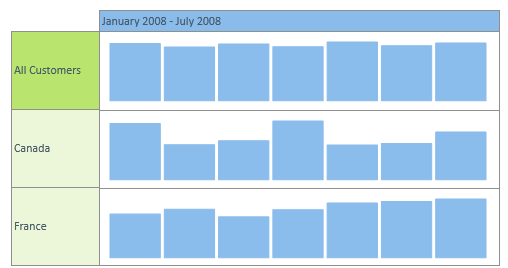
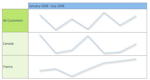
Spark Line Grids - Semi-graphical representations of data in simple line charts. The data section is replaced with "micro-charts" that are best used to display a large chunk of data where the exact values are not critical. Spark Line Grids behave like the Flat Multi-Color Grid in terms of ROW and COLUMN sections. Spark Line Grids are most commonly used when the COLUMN dimension consists of a time related elements. For details, see Spark Grids.
Spark Bar Grids - Semi-graphical representations of data in simple bar charts. The data section is replaced with "micro-charts" that are best used to display a large chunk of data where the exact values are not critical. Spark Bar Grids behave like the Flat Multi-Color Grid in terms of ROW and COLUMN sections. Spark Bar Grids are most commonly used when the COLUMN dimension consists of a time related elements. For details, see Spark Grids.
Accounting Grids - Depicts the hierarchical nature of the result set. The formatting of each row is dependent on the relative structure of the result set, such that if an element is the parent of any of the elements immediately above or below it in the grid, the element will receive a “higher level” and will receive a different formatting to denote that it is a “parent” within the result set.
Grid Right-to-Left Support
The grid provides right-to-left support (as do the textbox, chart legend and metadata trees). When a book has been changed via the Right-to-Left-Layout button in the Data Discovery: Report Tab, the grid will flip its data presentation - with the rows appearing on the right of the data grid and all text alignments inverted. The Right-to-Left mechanism supports cubes in right-to-left languages such as Hebrew and Arabic.
Grid Navigation
All grid types offer full interactivity and "data navigation" through a right-click context menu, including drill downs/ups, expand/collapse, dicing, focus/eliminate and cube actions. Grid types can be customized, styled and themed via the Data Discovery: Grid Tab.
Grid "Lasso" Selector
The grid lasso capability makes grid navigation simpler and more intuitive in numerous scenarios.
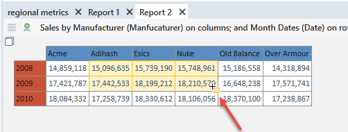
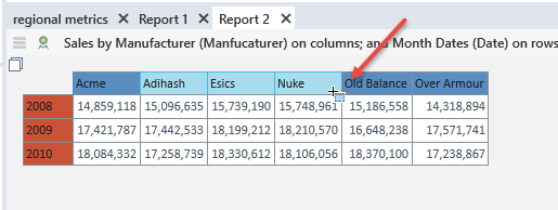
While hovering over different elements of the grid with your mouse, there are various 'drag and drop' options based on a lasso selector capability:
- Select data cells through drag and drop: hovering over the data cells of the grid and lassoing one or more using the LEFT mouse click, will allow the user to "zoom" into those cells using the YELLOW lasso effect.
- Select column or row cells through drag and drop: hovering over the column or row cells of the grid and lassoing one or more using the LEFT mouse click, will allow the user to "zoom" into those elements from columns or rows using the BLUE lasso effect.
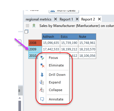
Select column or row cells through point and click: hovering over the column or row cells of the grid and selecting one or more elements using single LEFT mouse clicks with the CTRL and SHIFT keys, will allow the user to hand pick a disparate selection of row or column elements. Then, right clicking to display a context menu (red highlight below) that will allow the user to enact multi-element data operations: focus, eliminate, drill down, expand and collapse.
Grid Features
The table below covers the key features of the various grid types and highlights the similarities and differences between these grid styles.
| Type | Grid |
|---|---|
| Multi-Tier |
|
| Flat |
|
|
Flat Multi-color |
|
| Spark Bar |
|
|
Spark Line |
|
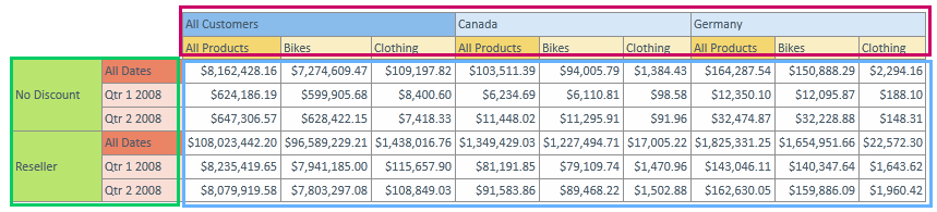
| Feature | Description | Common | Difference |
|---|---|---|---|
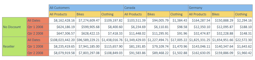
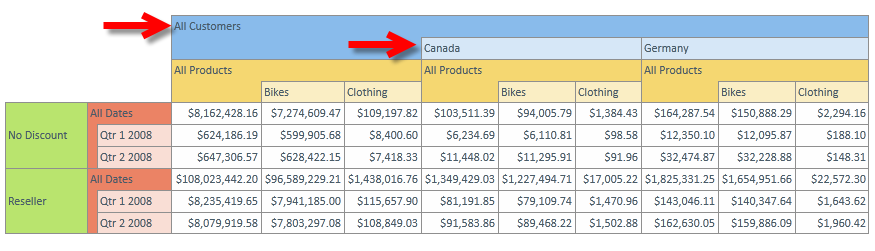
| Cross-Tab data representation | To show data in a ROWS and COLUMNS tabular format in order to better understand the relationship between different dimensions and measures in the chosen cube. (This is not a new concept!) | All grid types show data in rows and columns and reflect the dimensional selections made in the query. | The multi-tier grid will show the nesting of parent and child elements in the rows or columns, to visually highlight the hierarchical structure of the queried data and the underlying dimensions (red arrows above). The multi-color flat grid highlights the differences in the level depth of different member elements from the same hierarchy, |
| Dimensional Colors | To simplify the analysis, each dimension in a grid is assigned a different color - so that complex, multidimensional result sets are easier to understand. | Each dimension, on both rows and columns, has a different color. Initially set by the applicable theme for the grid, these colors can be customized using the grid tab. |
Multi Tier and Flat Multi-Color grids will show successive levels of a given dimension in a LIGHTER shade of the dimensional color, to make it easier to discern the inherent hierarchy of the data and the underlying dimensions (red arrows above).
Measures, having no hierarchy, appear as flat structures regardless of grid type. |
| Separate formatting control for the rows, columns and data sections |
The cross-tab multidimensional grid in Pyramid is conceptually three separate tables: one for ROWS, one for COLUMNS and one for the DATA cell set.
Each separate entity can be formatted separately via the Data Discovery: Grid Tab.
Certain features, however, apply across the entire grid - like gradients and border thickness. |
All grid types represent the 3-entity design concept and can be similarly customized . | none |
| Left Click |
Left clicking on either the ROW or COLUMN section will automatically drill down the highlighted element one level of detail in its hierarchy (if there is further detail).
There is no left-click function for the DATA section. |
This core functionality is present in all grid types. | none |
| Right-click Context Menus |
Right clicking on elements in the ROWS or COLUMNS will generate a context menu with numerous query functions: drill down/up, dice, expand/collapse, focus/eliminate and actions.
A different context menu is available for the DATA section allowing for Drill-Through cube Actions and "zoom".
Use these shortcuts to analyze the data without using the metadata trees. |
This core functionality is present in all grid types. | none |
Home |
Table of Contents |
Index |
User Community
Pyramid Analytics © 2011-2022